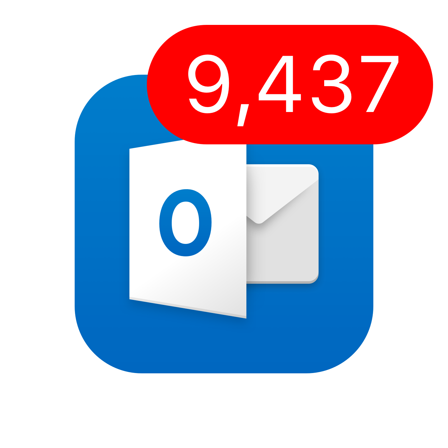
Have you ever taken a peak at someone's phone and seen 9,437 unread emails? Or maybe thats you? An email address is an essential tool but its usefulness as a communication medium is weakened when a user is bombarded by low value emails everyday. Focused inbox aims to separate out the signal from the noise so users can quickly see whats important, and then get on with their day.
The backstory
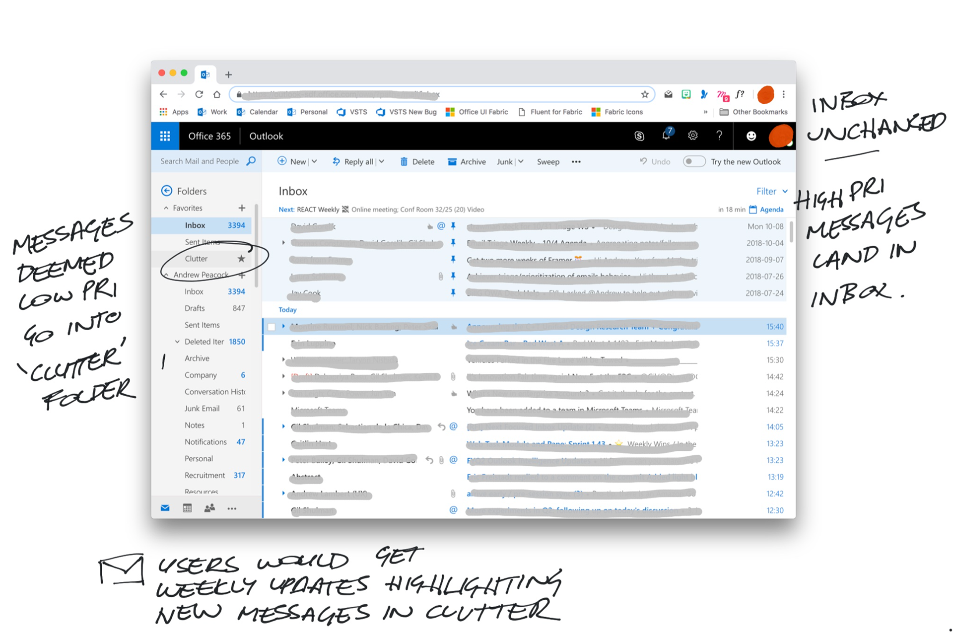
This was not Outlook's first foray into intelligently sorting mail. In 2014, Clutter was introduced, promising to clear the inbox of low priority mail and put it in a place that users could access at their leisure. However many users were caught off guard, unaware of the change. Additionally, the location of clutter also meant many people did not find it, which lead to users missing messages and the associated perception of data loss.
Mapping the previous experience
Before we started to architect a new experience it was important to review the current user flows along with the previous Clutter feature. We wanted to understand what had been previously attempted and where it fell flat.
We knew this was an important / critical problem to go after. We have a very clear understanding of the issues surrounding this. We hear it routinely when speaking with users, and we also have the quantitative data illustrating clearly how much junk and general noise is cluttering user's inbox.
Understanding the problem
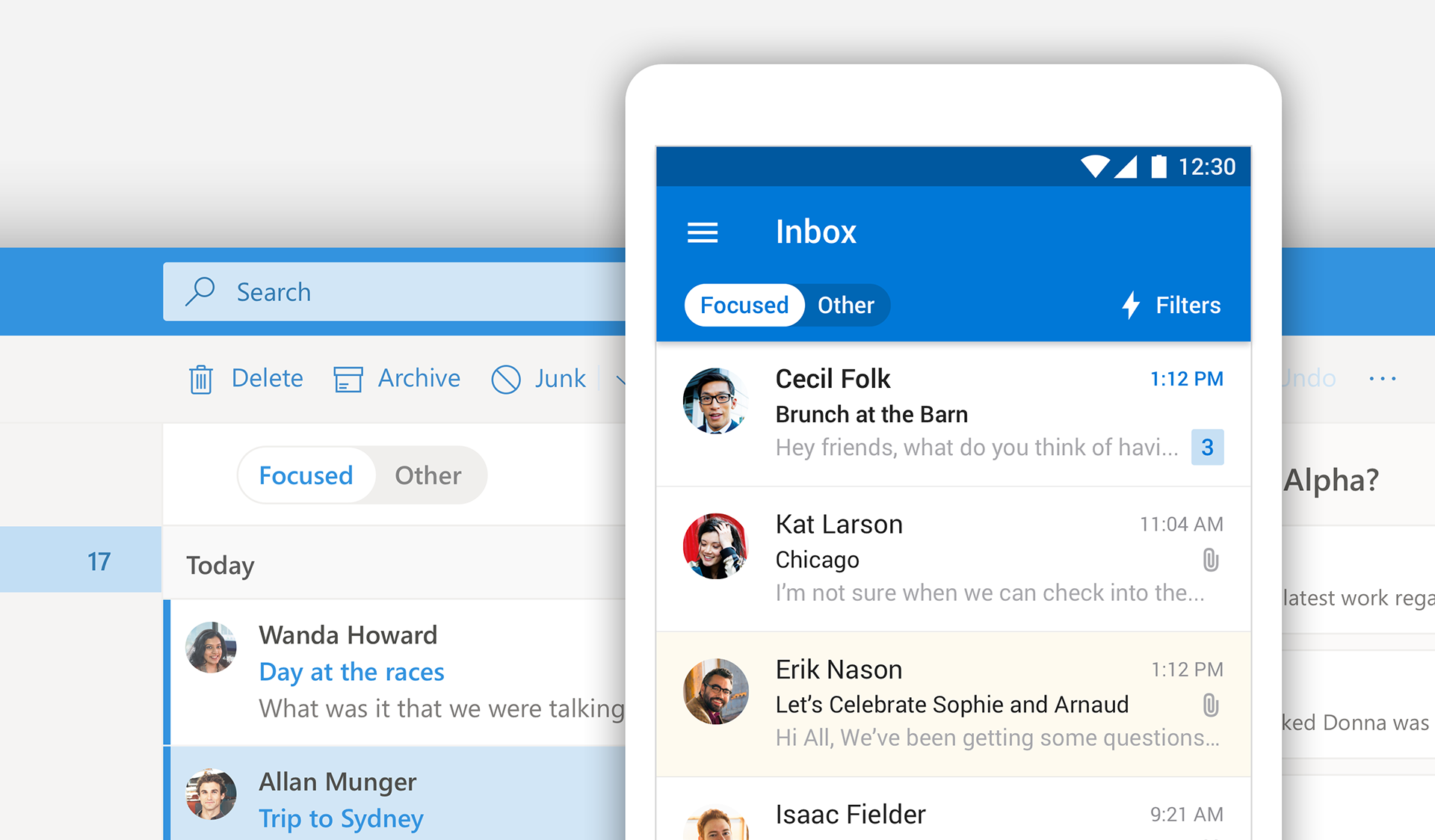
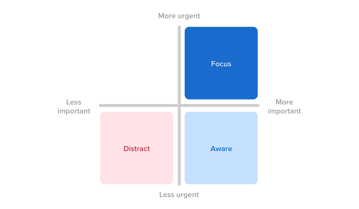
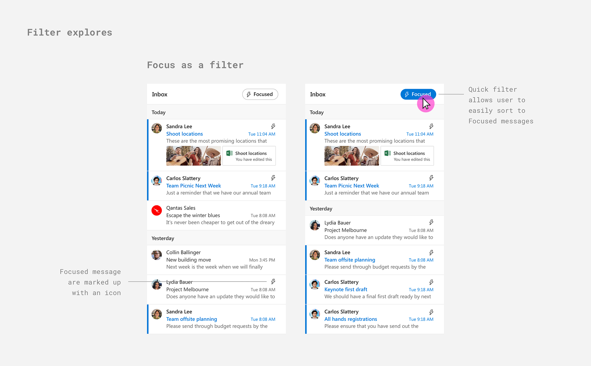
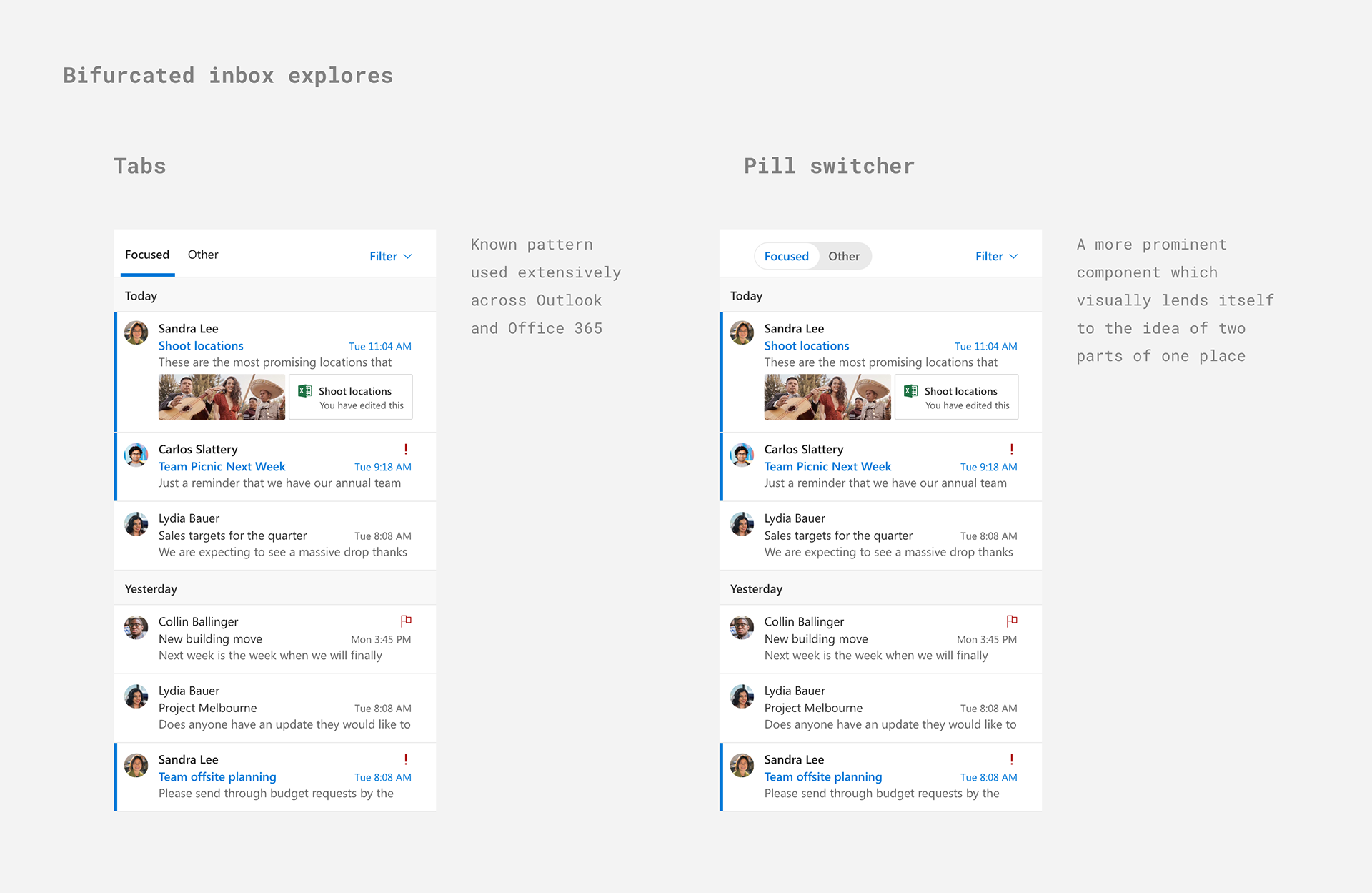
While there was merit to the model, the interaction pattern needed work. Through extensive research we uncovered that messages generally fall into one of three buckets - Focus, Aware and Distract. We aligned these broad message assignments with different locations where a new message will show up. Focus in Focused, Aware in Other and Distract in Junk.
By bifurcating the inbox at a high level we were able to parse out the important messages from all the rest but still have them show up in a discoverable place.
Brainstorming solutions
Now that we were aligned on the problem space, and the issues with the previous implementation, it was time to sketch out some possible solutions. It was important to keep in mind a number of considerations while I sketched developed these solutions:
Intuitive for users
Scalable for other endpoints
And the winner is...
As a feature team, we came together to review the various concepts and determine what design(s) we could move forward with. We decided that the Focused pivots was the design we felt most confident about. The interaction pattern of pivots was well established and understood, it was something our mobile customers were accustomed to and was highly visible. However these were all assumptions which we needed to test prior to building. We ran a number of studies and made some minor iterations before we began coding.
Teaching moment
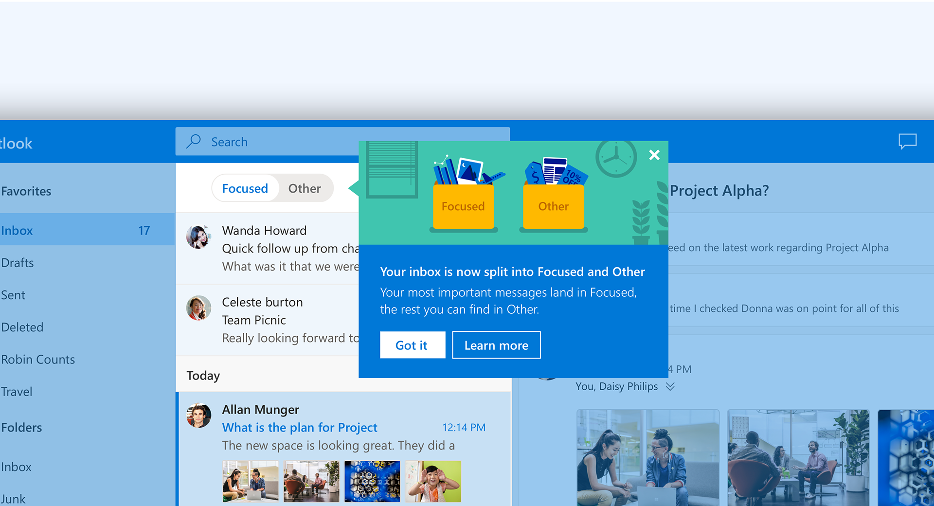
One key learning we had from the Clutter experience is the importance of change management. This update was a major shift in how users receive their email so we needed to be thoughtful and considerate in both how we broadcast that change, and how we rolled it out. Along with all the standard channels, we also did broadcast emails, in product call-outs and in-context cards to inform users of the change and also teach them about how it works.
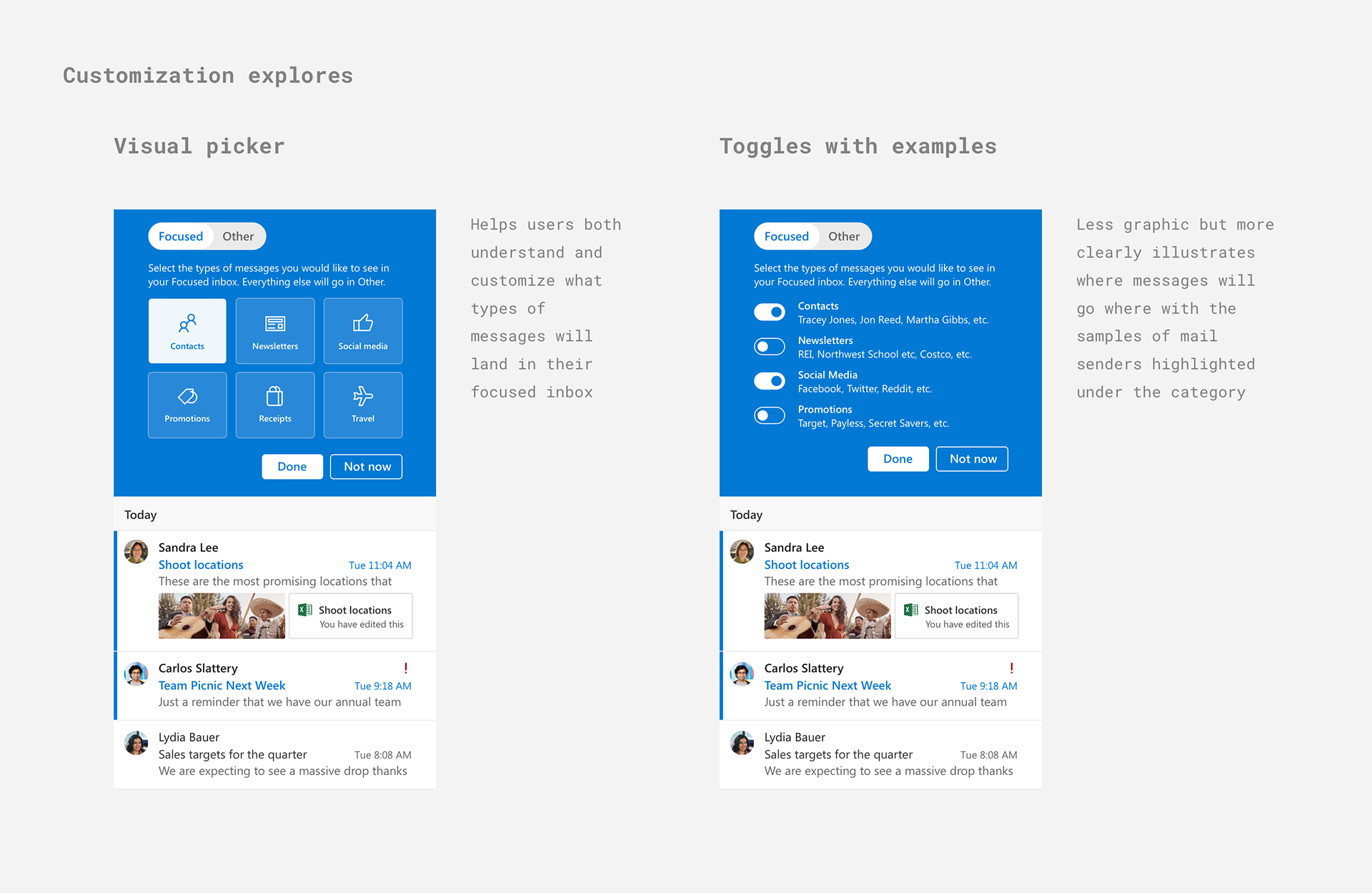
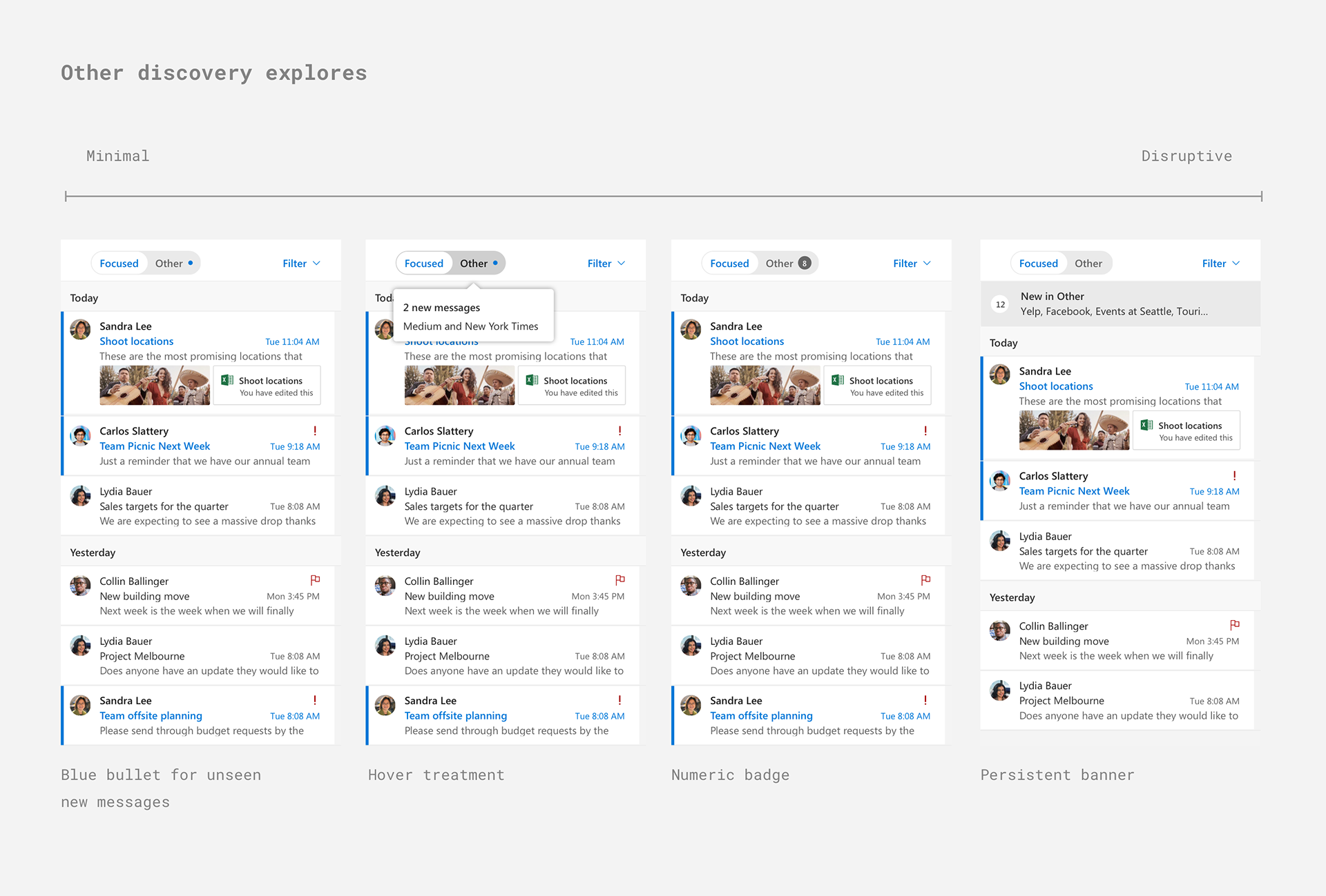
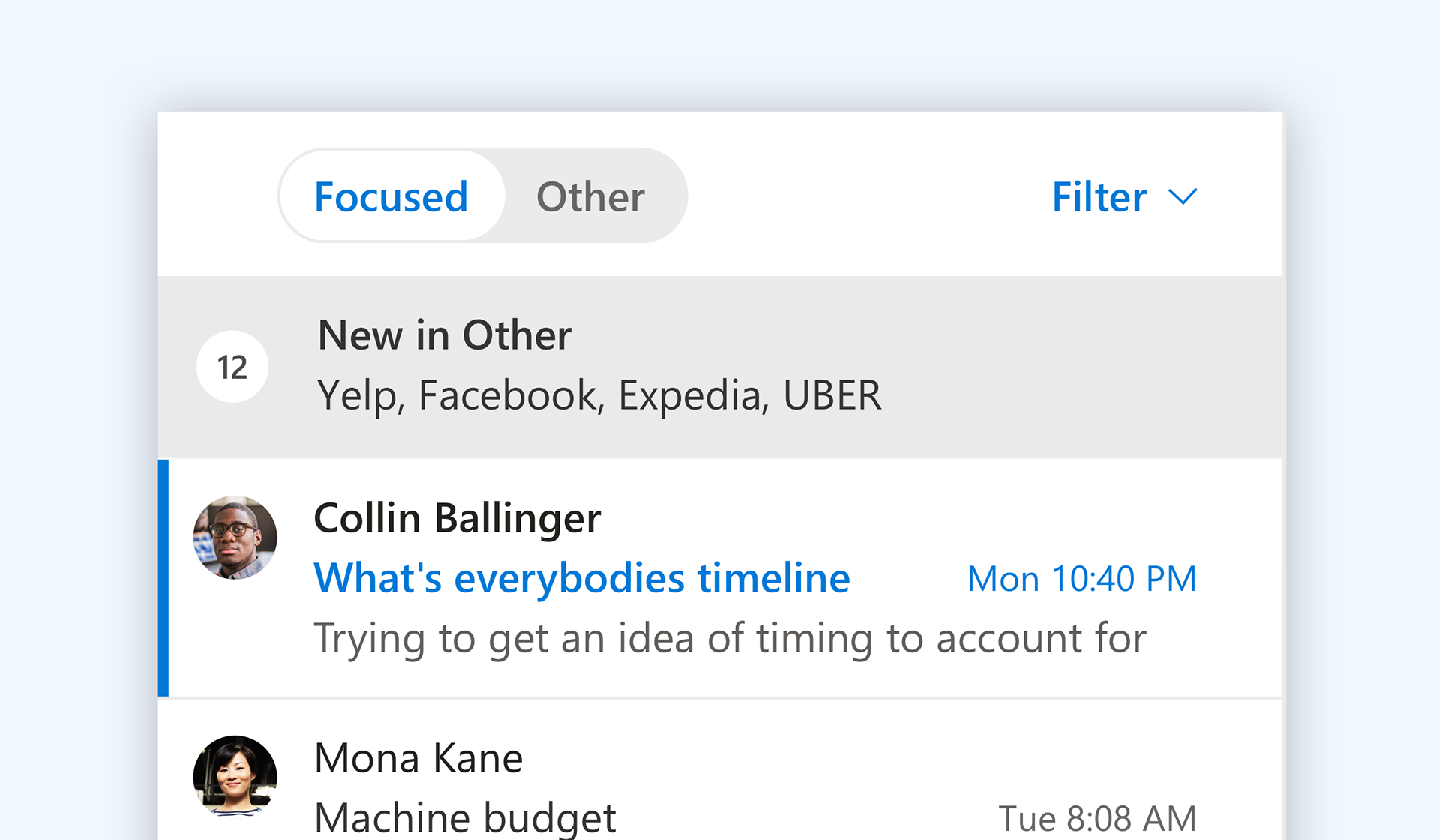
'Other' Discovery
Another important aspect to this feature was the notification affordance. If a user was in one pivot, we needed a way to notify them that there are new, unseen messages elsewhere.
Ship, Listen, Learn, Change
Shipping this feature was only the beginning. Through instrumentation within the product we were able to understand the health of the feature and it's associated impact on triaging behavior and overall product satisfaction. We continuously watched how users adopted this feature and made a number of tweak to its implementation to ensure it was valuable to our users and met it's slated user objectives.