Outlook is synonymous with email, but most people associate it with the feature rich desktop client. Moving the web client from a cumbersome old code base to React offered us an opportunity to redesign the entire product from the ground up.
Not only did we want to achieve feature parity with the previous version, but we set an ambitious goal to radically update the product, refresh the UI and modernize the feature set.
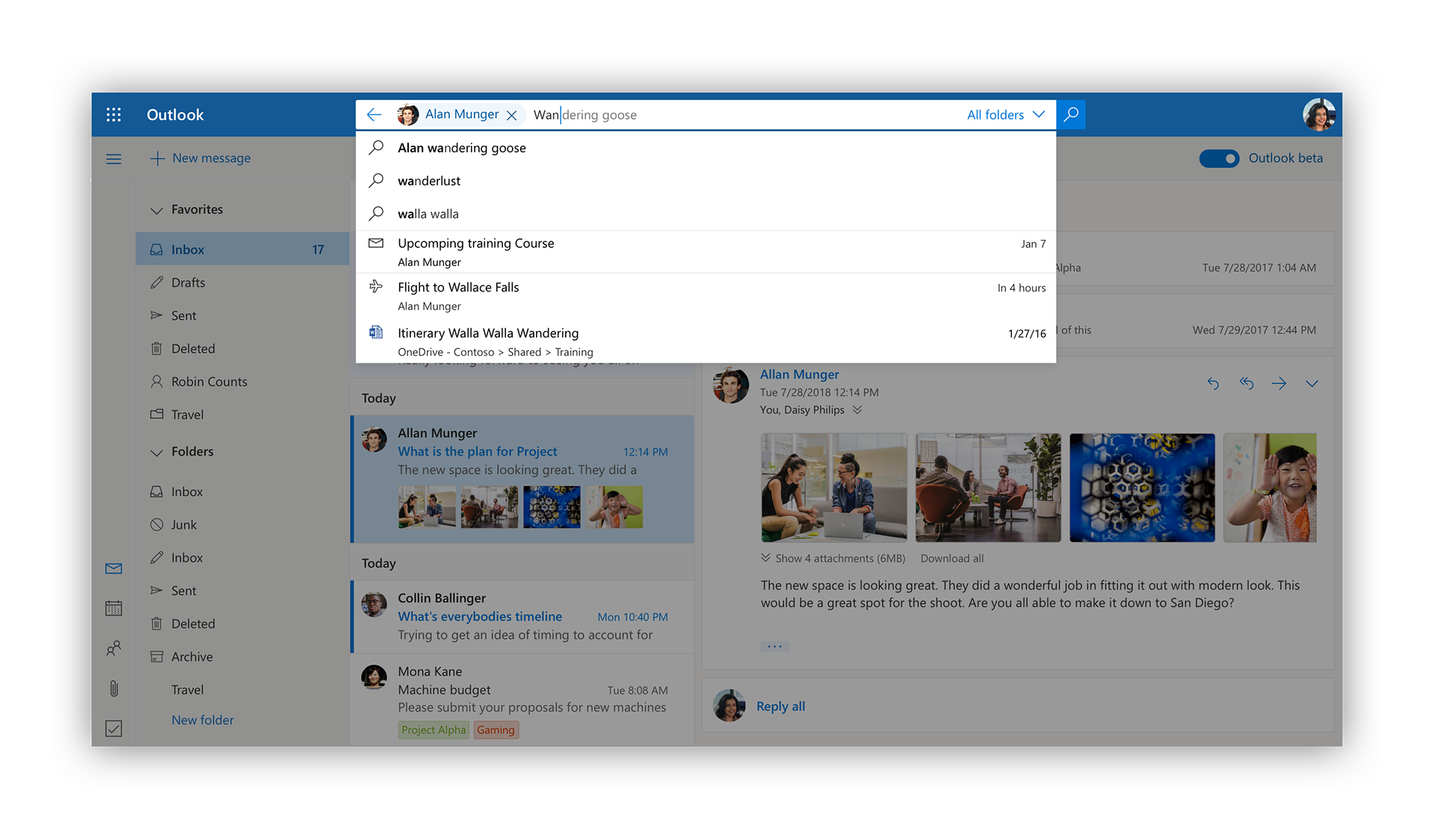
One of the most significant improvements we made related to search. We know that the majority of our users now use search as their primary method for mail, people and file discovery so we wanted to celebrate it by increasing it's prominence. We also introduced a host of functionality like zero query, search suggestions and people search while improving its performance and reliability.
Not only did we want to improve the functionality of the product, we also wanted to brighten up its personality. We established a beautiful, vibrant new illustrative language that was applied across the end points, making empty states and teaching moments more compelling and human.
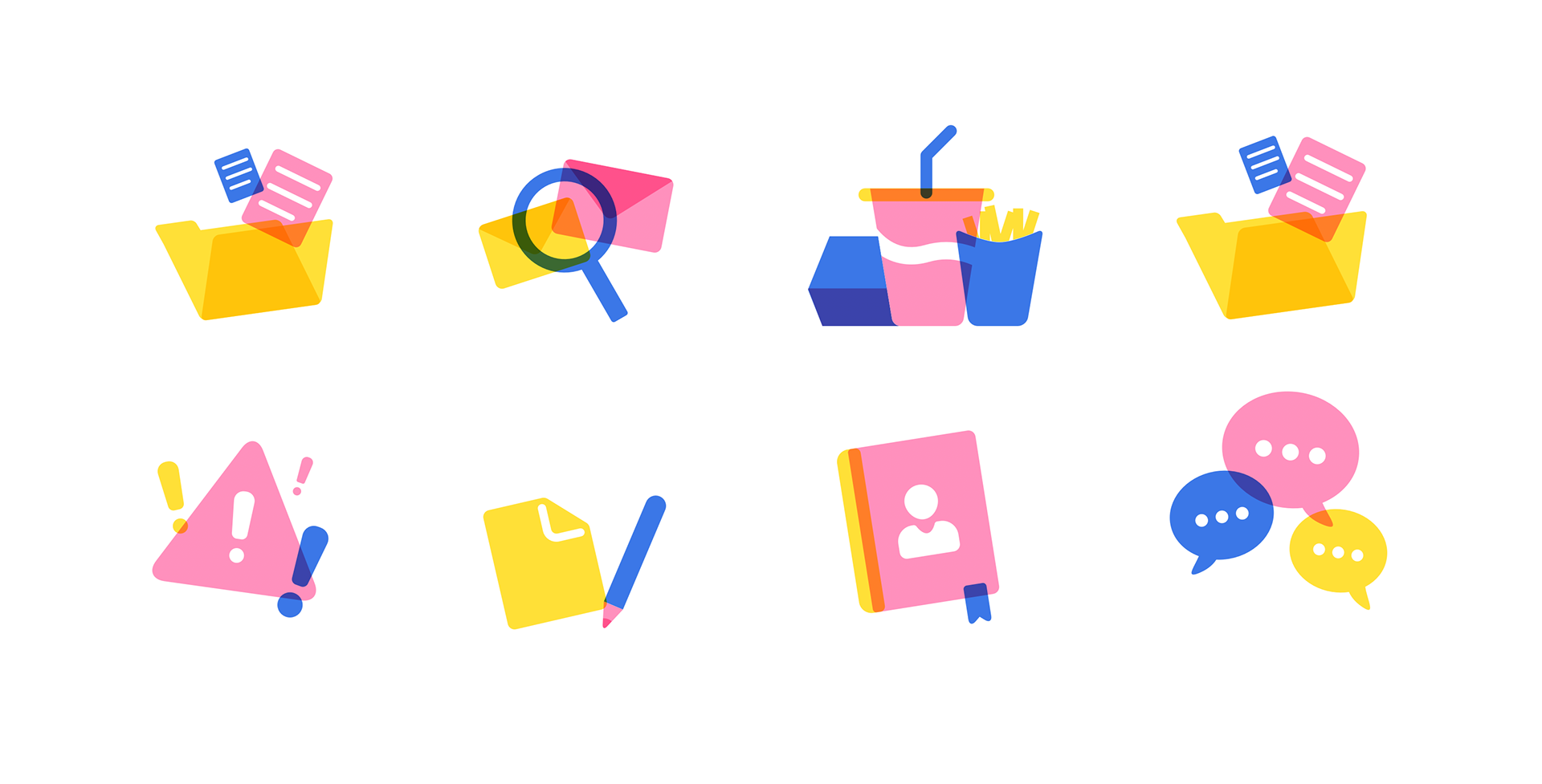
Illustrations by Adrien Griveau
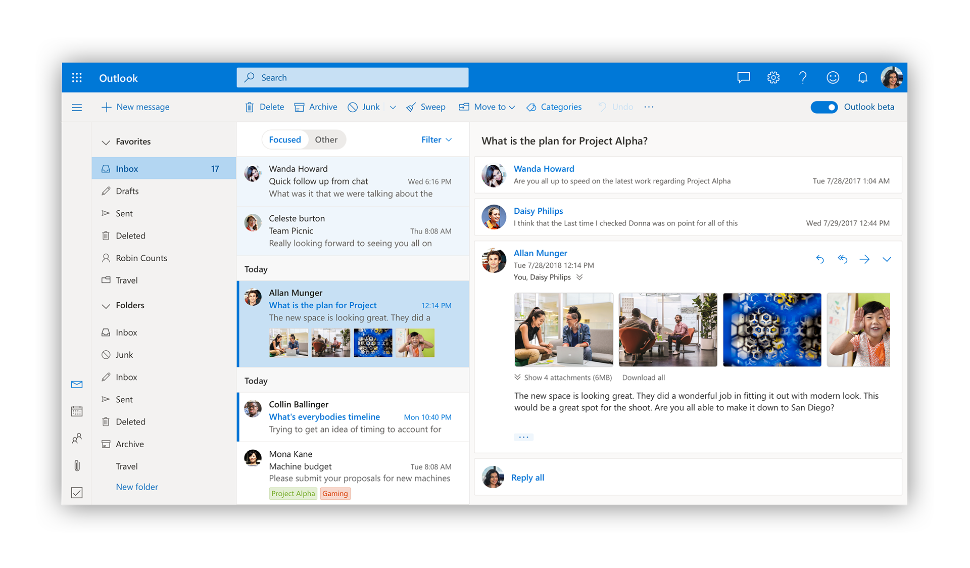
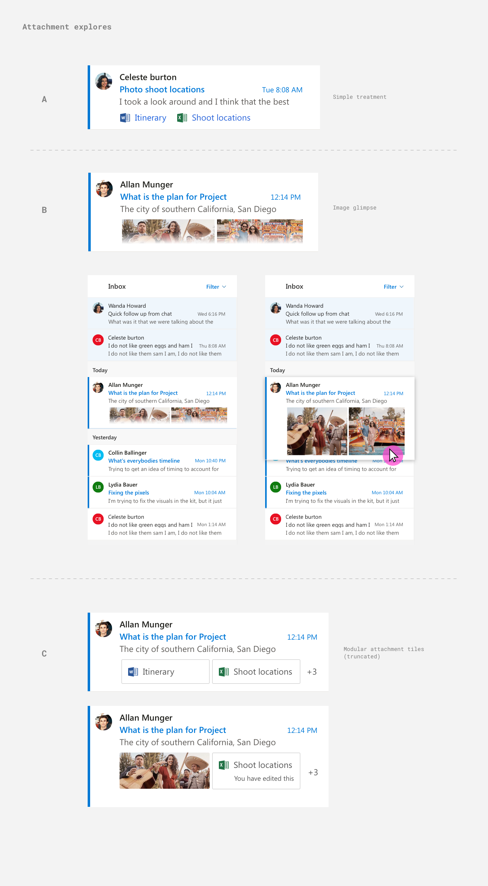
Most users start their Outlook experience with the message list. It's more than just emails - its how people manage their daily tasks, calendar appointments and communications. We wanted to elevate it from a plain list of words and make it more personal and easier to navigate.
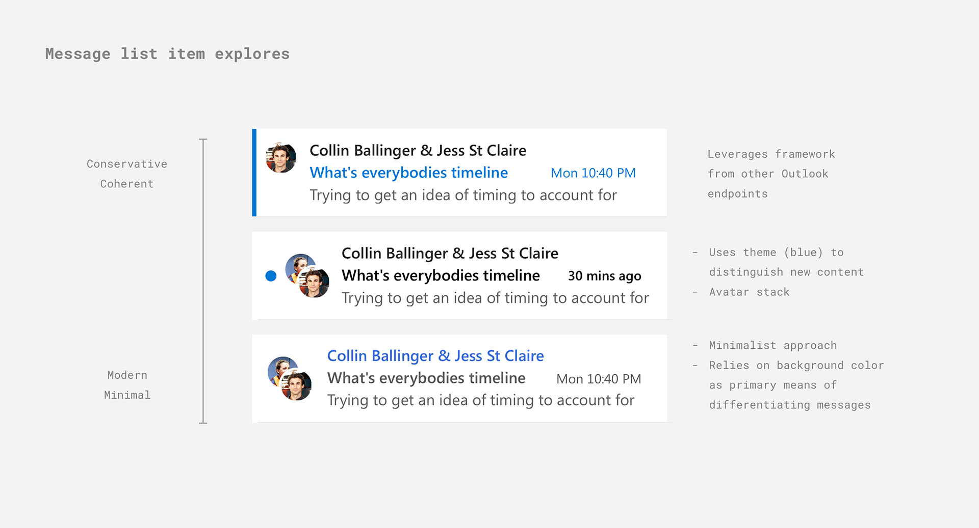
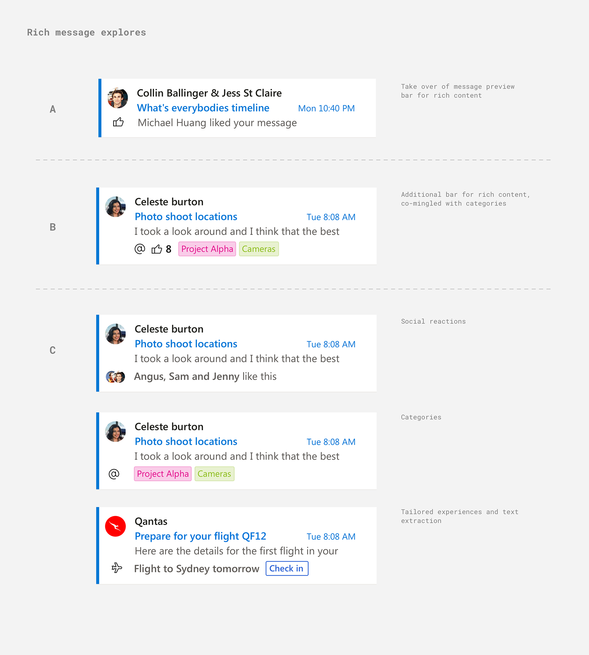
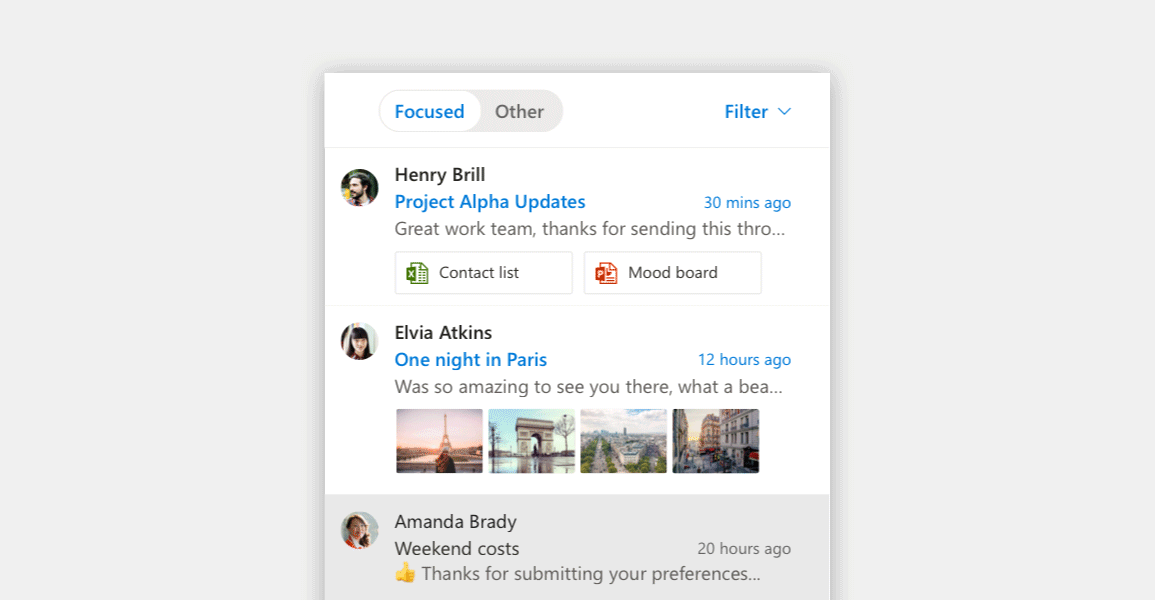
Adding avatars helped users quickly orientate themselves to important messages. Surfacing image and attachment previews allowed for quicker access to content alleviating the need to open a message.
An important aspect to this project and something we thought hard about was change management. Changing a product that is crucial to peoples' work and daily lives needs to be done thoughtfully and gently. We started with in-product announcements and a persistent toggle allowing users to switch between the new and old versions, capturing feedback as they did. We iterated quickly in the beta to address the most pressing items of feedback and then re-prompted users communicating all the benefits of being in the new experience. This allowed our user base to feel comfortable with the updates to the product before an change was forced upon them.
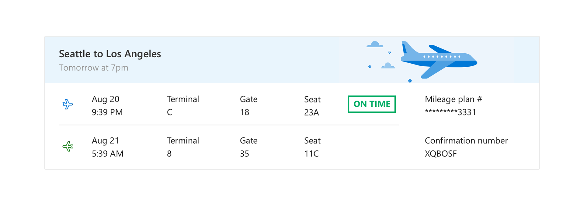
Rich cards from extracted email content